The Anatomy of a Good Landing Page


An effective landing page is the foundation of any successful marketing campaign. You may be running the most highly optimised PPC campaign, driving highly targeted traffic from paid social ads, but without a good landing page, chances are that you’re wasting all that initial hard work. Your landing page needs to be clear, concise, and drive people to convert on whatever you’re offering. Let’s take a closer look at the anatomy of a good landing page.
Standout Headline
Your landing page needs to include a clear, standout headline that instantly grabs the user’s attention. Without a standout headline, people won’t be inclined to read the rest of your landing page. Whilst constructing your landing page headline, think about how your product or service adds value or solves a problem for the reader. Focusing on this will be sure do help you drum up a headline that resonates with your target audience.
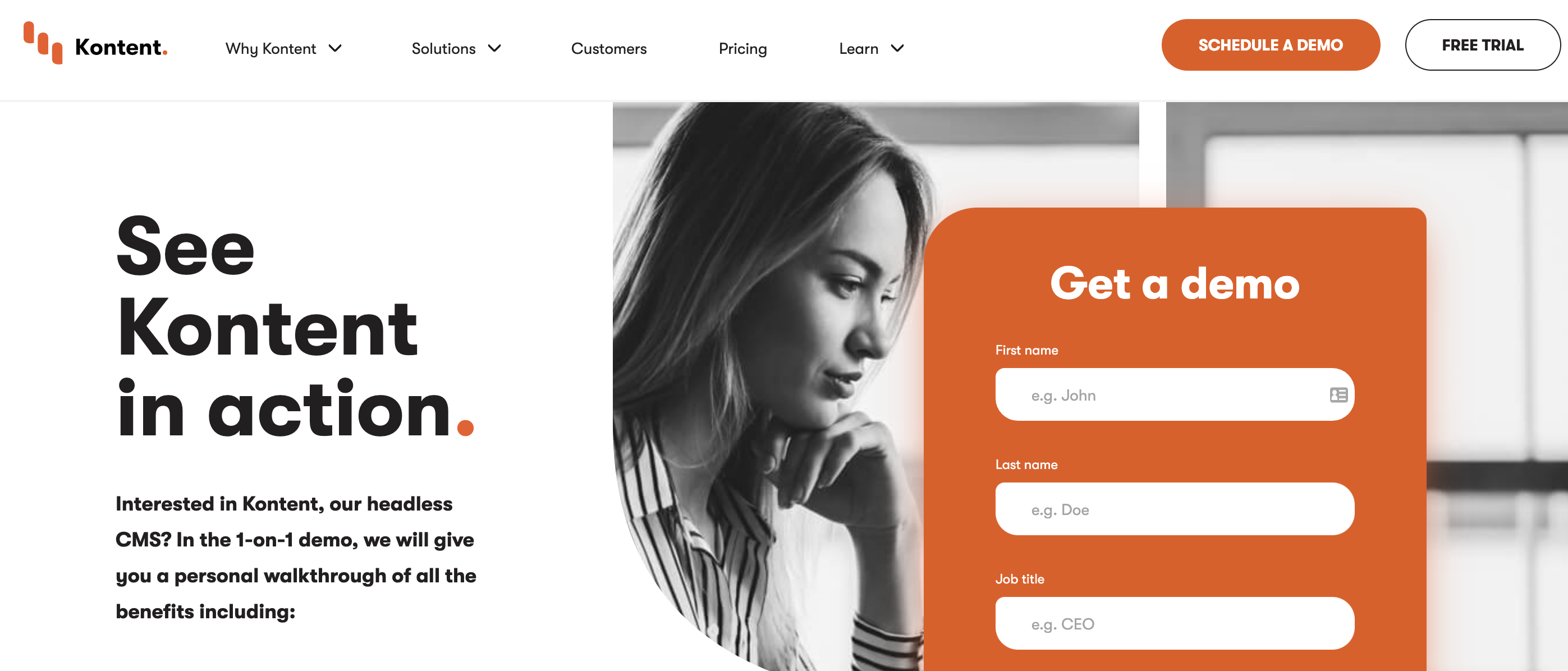
Best Practice Example
The Kentico Kontent landing page is a great example of a standout headline. ‘All Your Content in One Place’ resonates strongly with their target audience; marketers who are frustrated by using multiple platforms to manage their content.
No Navigation
Your landing page is essentially the last step of the funnel for your campaign, the place where your prospect finally converts. For that reason, you don’t want to give the user any other potential options to click on, other than your main call to action, whether that’s a simple contact form, download of an eBook or another piece of gated content. Allowing a user to navigate to other parts of your website only detracts attention from your main conversion goal.
Limiting your navigation becomes even more vital if you’re driving traffic from PPC, as it’s known to significantly harm your all-important quality score/landing page experience.
Best Practice Example
Salesforce has done away with its standard navigation menu on their PPC landing page. In its position are two clear, concise calls-to-action.

Social Proof/Testimonials
Your prospect has come a long way and they’re very close to converting. Give them that extra push they need by reassuring them of how good your product or service is. This could be a simple strip of client logos, or even better, a full testimonial from the client. This communicates to your client ‘X company are using this service and getting great results, maybe I should look at this too.’
It’s worth mentioning that you should try and make your testimonials as strong as possible. Avoid generic ‘they were great’ testimonials. Instead, try and lace your testimonials with statistics that have an impact on your readers.
You should also make use of any certification or award badges that add that extra bit of authority to your brand.
Best Practice Example
Trello, the project management tool uses social proof well on their homepage. They’ve included the logos of some of their largest customers with a link that goes straight through to their case studies section. It’s a really powerful piece of content that reinforces their brand.

Clear Call to Action
You’ve spent all of this time (and potentially ad spend) in driving targeted traffic to your page and trying to convince them that you’re the perfect partner. Let’s not fall at the final hurdle! Your page needs to include a strong call-to-action that’s instantly recognisable and accessible to the user.
The CTA should stand out against the rest of the page, so don’t be afraid to experiment with different colours, even if they stray slightly away from your usual brand tones. In terms of call to action button copy, try and make it relevant to your offering. For example, let’s say we’re offering a free SEO audit. In this instance, we could use something like ‘Audit My Website’ or ‘Get My Free Audit’. I’m sure you’ll agree that it’s much more enticing than a basic ‘Sign Up’ or ‘Submit’ button.
Best Practice Example
We’re going to use the Salesforce example here again, as they use a strong CTA when you’ve been dormant on their page over a certain period. If you don’t take any action on their standard CTA’s, a pop up appears with a secondary CTA and an option to call for assistance.
Clear Copy
Your landing page is driving the user to one particular offering, so make sure that your copy is clear, concise and relevant to what you’re trying to achieve. Don’t waste vital landing page real estate by bulking out your text. Get straight to the point and separate your copy into subheadings and short sentences. Make use of bullet points or icons to give a bit more context to your written content.
Best Practice Example
Sitecore does well to cut down their copy into bite-sized chunks on their landing page. By creating 3 USPs with icons, the user can quickly scan across the title and understand the advantages of using Sitecore CMS without having to read long paragraphs.

Engaging Video Content
If you have video content, including it on your landing page can be an extremely powerful way of conveying your message quickly. You could use it to describe the benefits of your eBook, or you could include a video testimonial of your clients speaking about how good your service is. Including video on your landing page has been known to increase conversions by up to 80%.
Best Practice Example
ClickFunnels are masters of using video content to convert users on their landing pages. Take a look at their homepage and you’ll see no fewer than 14 videos designed to convince any marketers who land on the page that ClickFunnels is the solution for their marketing automation needs.
Keep Improving Your Landing Page
It’s not time to put your feet up yet! Developing the perfect landing page is a non-stop process. Your page should be constantly evolving as there’s always room to improve your conversion rate and increase your lead generation. You should make use of A/B testing software to continuously tweak elements of your page in small steps. If you’ve got a CMS platform like Kentico, you can make use of its built-in A/B testing tool, or you can use Google Optimize to achieve the same results.
Follow the essential elements listed in this article and you’ll have a great head start in developing a landing page which is ripe for conversions.