5 Things Ruining Your Membership User Journey


Membership sites are all about connecting people, and this trend has only intensified in recent years. It’s likely to continue, necessitating user-friendly membership sites like never before. To stay relevant and ensure your users have a positive experience, continuous improvement based on user feedback and needs is essential.
Certain areas consistently require updates and enhancements. Here are five key factors that could be ruining your membership user journey, worth considering when analysing your site’s performance.
Hard-to-Find Content
Navigating a site can be a major issue for many membership organisations, especially those whose websites were built several years ago. As user experience (UX) standards have significantly evolved in the past five years, the demand for seamless navigation has become more pronounced.
Organisations are now revamping their sites to stay competitive. Poor navigation is a leading cause of user abandonment. If users can’t easily find the content or perform the actions they came for, they’ll likely leave for another resource.
Content is the primary reason members visit membership sites. These sites usually house vast resources, with memberships often having thousands of web pages. But when you get to this size, finding specific content can be frustrating, especially in larger organisations with diverse user personas. These users want to access relevant content without sifting through irrelevant material.
It's a major challenge for almost every membership organisation that we come across, and a key reason why a robust search facility is almost part of every single brief.
Not Portraying Organisational Values
Users often complain that membership sites fail to clearly communicate their key values. From a user’s perspective, understanding what an organisation stands for should be immediate upon visiting the site. However, this is rarely the case. Typically, users must scroll through several sections to piece together the organisation’s values.
With member retention being more important than ever, surely it's time to really showcase the value that members get for their money?
Poor Visual Design
Post-COVID, many membership organisations are redesigning their sites due to outdated visual designs. Visual design trends have advanced significantly in recent years, leaving older sites looking dated.
And with memberships needed to be more digitised than ever before, we can't get away with sub-par online experiences.
A modern visual design enhances user experience, as poor design often correlates with poor navigation and hard-to-find content. A lack of visual hierarchy makes content harder to scan, increasing the time needed to complete user journeys.
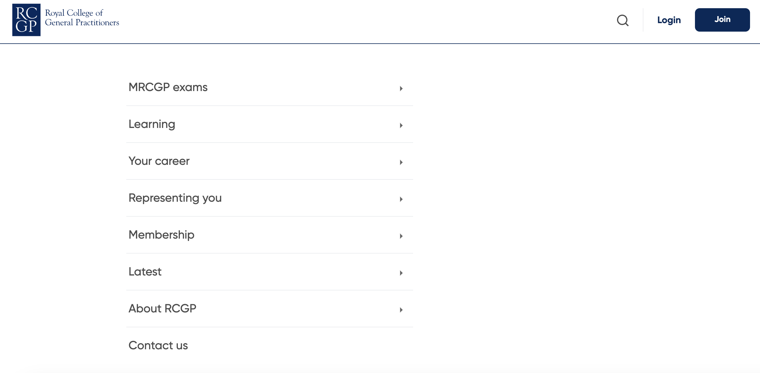
Take the Royal College of GP's website as an example. The first image is of their site before redesigning. It had an incredibly busy menu with no real logic, and multiple links leading users down the same user journey.
The second image is of their new site. We were able to simplify the journeys into a select few categories which are now accessible via a clean, well-organised hamburger menu.
Before redesign
After redesign
Lack of Personalisation
Membership sites often serve multiple user personas. A one-size-fits-all interface filled with generic content slows down and frustrates users. Personalisation, showing users content relevant to their persona, would make their journey more efficient and satisfying.
Personalised features, such as saving a user’s last journey and offering it as a quick link at the top of the page, can further streamline the experience. With the advancements in AI, implementing such personalised experiences has become easier than ever.
But stats from the MemberWise Digital Excellence Report show that 47% of membership organisations are falling short when it comes to implementing personalisation.
Poor Mobile Experience
Today’s users are more likely to use their mobile phones than laptops for quick tasks. Unfortunately, many membership sites offer poor and frustrating mobile experiences. There’s nothing worse than struggling to read or interact with a site on your mobile phone and needing to switch to a laptop.
This issue is especially problematic for community activities and forum interactions, which users are likely to engage in on their mobile devices.
By addressing these issues, you can significantly enhance the user journey on your membership site, leading to greater user satisfaction and retention.